
Guides
We rebuilt the 1410SMS mobile app, screen by screen
Why the app needed more than a coat of paint, what changed in the redesign, and the rule we used to decide when a screen was finished.
The first version of the 1410SMS mobile app did the job. Staff could mark a register on it, parents could check a balance on it, and it worked offline on a bad connection, which in a lot of Nigerian schools is the whole ballgame.
It also, if we are honest, looked like a filing cabinet.
Version 1.1.0 is the result of going back through every screen in the app and asking a question we should have asked earlier: does this feel like something built for a phone, or like a website that has been squeezed onto one?
The problem with "it works"
An app that works is not the same as an app people reach for.
A bursar with a laptop open will use the laptop. A class teacher standing in a corridor will not open a laptop, so if the app is awkward the register gets marked later, from memory, which is how attendance data quietly stops being true. The gap between "the feature exists on mobile" and "people actually use it on mobile" is almost entirely a design gap.
Three things were pushing people back to the browser:
Every screen looked slightly different from every other screen. Some had a card with a shadow, some had a card with a border, some had neither. Status colours were whatever green or red that screen's author had picked. Nothing was wrong exactly, but nothing agreed either, and the cumulative effect is that an app stops feeling like one product.
Half the finance features were read-only. You could look at an invoice on the phone but not record the payment against it, so anyone doing the actual work was going back to a desk anyway.
Some screens were built like web pages. The clearest case was taking a test: one long scroll with every question on it, which is exactly how you would build it for a browser and exactly the wrong shape for a thumb.
What we changed
One header, one card, one set of status colours
The app now has a shared screen shell. Your school's logo and name sit above the screen title in the same position on every screen, over a soft backdrop, with summary panels rendered as flat cards with a hairline border rather than floating on a shadow.
That sounds like a small thing. It is the difference between an interface you read and an interface you decode. When a paid badge is the same green on the invoice list, the invoice detail, the pupil's record and the dashboard, you stop reading the word and start recognising the colour, which is faster and is what a native app is supposed to feel like.
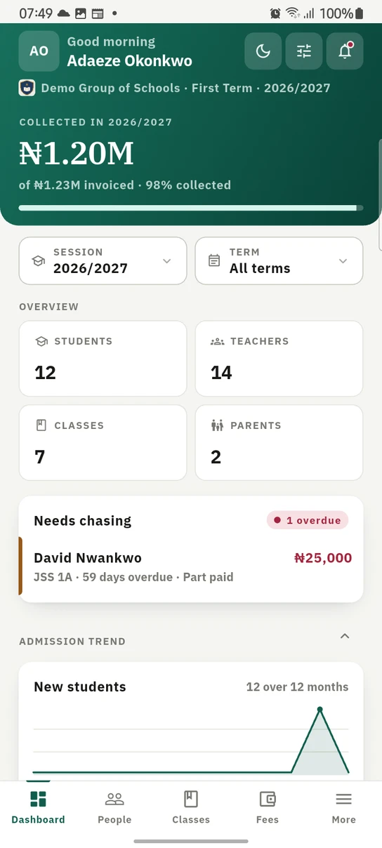
The staff dashboard. The same widgets, the same period filter and the same permissions as the web.
Tablets, and very large text
Two cases we had been quietly ignoring.
A tablet was getting the phone layout stretched wide, so a four-across row of figures sat as two columns with a lot of empty space. Stat grids now go to four columns above 600dp with wider margins.
The other was more embarrassing. With the system font size set to its largest accessibility value, a single word could become wider than the fixed-width column it sat in, and the layout engine responded by wrapping one character per line. Text scaling is now capped at a point where every layout still holds together, which is not a perfect answer but is a great deal better than a column of individual letters.
Finance you can actually run from a phone
This was the biggest functional gap, so it got the most work. The app now has:
- A Payments workspace with the verification queue, so a payment can be reviewed, verified, rejected with a reason, or voided if it was recorded in error, without opening a browser.
- Invoice search and sort, because scrolling to find one invoice is fine with thirty and impossible with three hundred.
- Fee structures, so the fee types an invoice is built from can be created and edited on the phone rather than only read.
- Bulk reminders: long-press to start selecting, tap to add, one action to send every selected parent their own reminder.
- Analytics and outstanding, including a collection-rate ring, a twelve-month trend, and the debtors list.
- Fee discounts, both the catalogue and the awards against individual pupils.
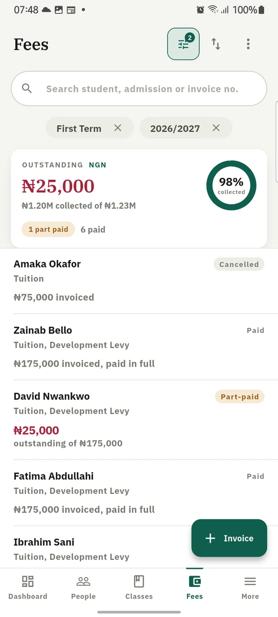
Outstanding balances get one card per currency, because balances in different currencies are never added together.
Every one of those is gated on the same permissions as the web, so what a role can do does not change depending on which device they are holding.
Taking a test, redesigned
Candidates now see one question at a time, with a numbered strip above showing which questions are answered, which one they are on, and letting them jump straight to any of them. Submit is available from any question rather than only the last, and asks for confirmation if anything is unanswered.
While we were in there we fixed something worse than a layout problem. The countdown had been driven by the test's duration rather than by the deadline the server issued, which meant reloading the page bought a fresh full timer. It now runs off the server's deadline, so the clock a candidate sees and the cut-off the server enforces are the same clock.
The screens nobody wants to see
Two failure states were badly served.
A school whose subscription had lapsed got empty screens and a Try again button that could never succeed, because every request was being refused. The app now says so plainly, explains that renewal happens in the web portal, and restores itself the moment payment goes through.
And figures used to go stale. Recording a payment updated the invoice but left the dashboard on its old number until you reopened the screen, which is exactly the kind of thing that makes someone distrust a total. Writes now invalidate the figures they affect, so what you see after an action is what actually happened.
The rule we used
Partway through, we stopped arguing about individual screens and settled on a test.
A screen is finished when nothing about it tells you it came from a web page.
Not "does it look nice". Not "does it match the mockup". Whether anything on it, a layout, a control, an interaction, a scroll length, would only make sense on a desktop. A form with fourteen fields in a single column fails that test. A confirmation you can only reach by scrolling to the bottom of a long list fails it. A table with five columns squashed to phone width fails it badly.
It is a useful rule because it is answerable. Two people can disagree about whether a card should have a shadow for a long time. They can settle "would you build it this way if the web version did not exist" in about a minute.
What is next
The redesign is not a finished project, it is a standard we now hold new screens to. The next passes are the academic side, which has had less attention than finance, and offline behaviour, where the app is capable but does not always explain itself well enough.
If you use the app, update to 1.1.0 and tell us where it still feels like a website. That feedback is more useful to us than almost anything else.

The iPhone and iPad app is coming soon.
The full list of changes is in the release notes, and Mobile App in the documentation covers signing in, push notifications and offline support.
Keep reading
Operations
Your school knows who was in class. Does it know who was teaching?
The pupils' register is taken every morning. Staff attendance is a signing book on the front desk. Here is how we built the second one, and the four things we deliberately refused to do.
Read article
Operations
Nobody should draw an exam timetable in pencil
One person draws the exam grid, one paper moves, and the whole thing needs checking again by eye. Usually it is not. Here is the workspace that replaced the pencil.
Read article
Ready to try it with your school?
Three-month Basic trial. No card required to register.