
Getting Started
Role-Based Dashboards
Personalised, widget-driven dashboards for every role. Admins, teachers, students and parents each see the metrics that matter to them, with per-user customisation.
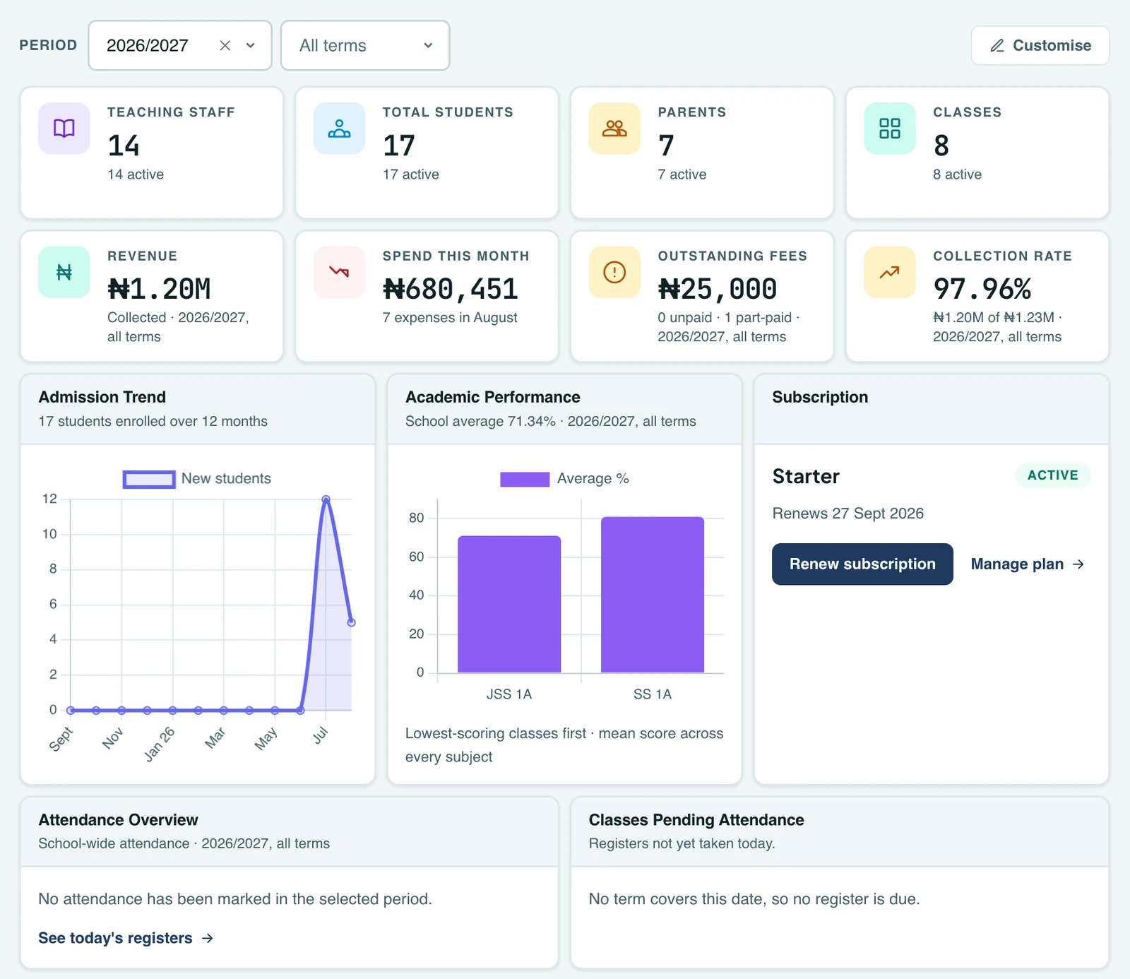
Every user lands on a dashboard built for their role. Admins see school performance, teachers see their teaching day, students see their lessons and results, and parents see their children. Each dashboard is assembled from independent widgets that load their own data.
What each role sees
- Admins. A dashboard in six rows: how many students, teachers, parents and classes you have; then revenue, spend this month, outstanding fees and collection rate; then the admission trend, academic performance and your subscription; then attendance overview and the classes still awaiting today's register; then tasks needing attention, recent activity and quick actions. Recent payments, collection by class, the revenue trend and the fee summary live on the Finance Workspace, where fuller versions of all four already were. Finance widgets appear only for staff whose role grants finance access, attendance analytics only with the analytics permission, and so on. The dashboard follows your Roles & Permissions configuration automatically. A further set of operations widgets is available to switch on for the roles that run the school day to day: today's examinations (papers being sat today, from published exams), grade entry progress (how much of the term's marking is in, class by class, with the least complete first), average marks by teacher (the mean mark pupils scored in each teacher's lessons, worked out from who is timetabled to teach what, so it tells you plainly when no timetable has been built yet rather than showing a blank), and recent announcements (the last messages your school sent out). An Owner or School Administrator gets all four from the start, since they run the whole school. For everyone else they begin hidden, and a head of department or bursar can turn on the ones they want under "Customise".
- Teachers. Homeroom and teaching classes, subjects, today's timetable across all their classes, weekly attendance for their homeroom, CBT, and quick actions. These are personal widgets, drawn from the teacher's own record, so they appear on teaching accounts rather than office ones. An Owner or Accountant has no homeroom or timetable to show.
- Class teachers. Everything above, plus a section about the homeroom they are responsible for rather than the subjects they teach: whether today's register is in and how the class has attended over the term, the pupils whose attendance has slipped far enough to be worth chasing, the class average and the subjects it is weakest in, what the class still owes (per currency, and how many pupils owe it), and pupils who have joined recently and are still settling in. The fee card appears only for a class teacher whose role also grants finance access; everything else appears regardless. A teacher who runs no homeroom sees the section say so rather than watching it vanish, so "I have no class" is never confused with "I am not allowed to see this".
- Students. Today's lessons, attendance over the last 30 days, upcoming events and school closures, upcoming exam papers, recent results, and quick access to every student feature.
- Parents. Each linked child with class, class teacher and fee position (grouped by school for multi-school parents), attendance for the current term, outstanding fees, recent results, upcoming exam papers, upcoming events and school closures, today's lessons, report card links, and the latest announcements and notices.
The parent widgets cover all their children at once rather than asking them to pick one first. A parent with three children gets all three balances under "Outstanding Fees" with anything overdue at the top, and a rate for each under "Attendance", so the question they opened the page to ask is answered in one look. Each row names the child it belongs to and links through to their full record.
There is one staff dashboard, not a fixed admin one and teacher one. What appears on it comes from the role your school assigned you, so a role you created yourself gets its own dashboard rather than a stripped-down version of someone else's. An Accountant opens on the finance widgets and the student and parent counts, with no attendance analytics or audit trail. A Principal without finance access sees the counts, attendance and exams, and no money at all. Your dashboard greets you by that role's name. If a role carries no dashboard permissions yet, it says so and points you at the menu, rather than showing you an empty page.
Trends: where the school is heading
Counts tell you where the school stands today; charts tell you which way it is moving. Two of them sit on the dashboard as widgets like any other, so they can be hidden, reordered or collapsed.
- Admission Trend. New enrolments per month over the same year. It counts every student who joined in a month, including any who have since left, so the intake you actually had is not quietly rewritten by later departures.
- Academic Performance. The school's mean score for the selected period, with the classes scoring furthest below it listed first. Averages are calculated based on the marks available.
Admissions always show a full year regardless of the period filter, because a trend needs something to trend against. Academic performance follows the filter, since a term's results are a term's results.
The revenue trend, meaning what you invoiced and what you collected in each of the last twelve months, lives on the Reports tab of the Finance Workspace rather than on the dashboard, where there is room for it. If you collect in more than one currency, a small currency toggle in the chart's header lets you switch between them, one currency at a time, each on its own scale. It is drawn this way rather than as several charts stacked down the page, or one chart in several colours, because currencies cannot share an axis: a two-million-naira month and a five-hundred-dollar month are worth about the same, but as raw numbers they are thousands of times apart, so if plotted together, the smaller currency's line would sit flat on the floor. The toggle keeps it to one clear chart no matter how many currencies you take. Unlike the summary cards and the invoice table beside it, the trend does not follow the workspace's term and session filter: it is a trailing twelve months across every term, and it reads the same whichever period is selected. A term is too short to read as a trend, so narrowing the chart to one would leave almost nothing to draw. For a figure that answers for a single term, read the summary cards rather than this chart.
Schools that invoice in more than one currency
Amounts in different currencies are never added together anywhere in 1410SMS. A total mixing naira and dollars would be a number with no meaning. That leaves the money cards, which show a single figure, so the dashboard puts a currency switch next to the period filter. Revenue, Spend This Month, Outstanding Fees and Collection Rate all follow it together, so the four can be read against one another rather than each quietly describing a different currency.
It only appears if your school actually has figures in more than one currency. If you invoice in one, as most schools do, there is nothing to switch and no control to see. The list comes from the currencies you have really invoiced in for the selected period, and your choice survives changing the period whenever that currency is still there.
Filtering by session and term
Staff dashboards carry a period filter at the top of the widgets, defaulting to your school's current session with all terms included. Unpaid fees carry across terms, so the session total is what you want when you are chasing arrears. You can narrow it to a single term, or clear either box to go back to all terms or all time. Every figure it affects names the period it covers, so a number never changes meaning without saying so.
Money and attendance figures follow the filter. Spend this month, recent payments and upcoming examinations deliberately do not. Spend is a calendar month because rent, salaries and diesel are monthly commitments a school compares against last month, and a term is three of them; the others answer "what happened today" and "what is coming", not "how did that period go".
Today's Payments widget is switched off by default on the dashboard. A school that wants it can turn it on in "Customise", but the slot it used to hold now shows what the school has spent this month, a question nothing else on the dashboard answered. Today's takings are on the Finance Workspace whenever you want them.
Shared dashboard elements
- A personalised welcome banner with your school's branding, the current academic session and term, and a live date & time clock
- Global search. Search every page you can open (and, for staff with the permission, students by name or admission number) straight from the dashboard header
- The notification bell with your unread in-app notifications
Customising your dashboard
Your dashboard opens on the widgets most people need day to day, not on everything your role is allowed to see. A school Owner can see every widget in the platform, and showing all of them at once would bury the ones that matter. The rest are one click away.
Click Customise above the widgets to make the dashboard yours:
- Show or hide any widget. The ones that start hidden appear here as outlines, ready to add, the same way you would choose extra columns on a table
- Reorder widgets with the move controls
- Collapse a widget to a slim title bar (collapsed widgets don't even fetch their data) and expand it again anytime
- Switch between a Comfortable or Compact layout density
The mobile app has the same customise screen. Tap the sliders icon in the dashboard header to show, hide, drag-reorder or change the density of its widgets. A phone shows a focused subset of what a browser does, so the two dashboards are not identical; each keeps its own arrangement, and rearranging one never disturbs the other.
Permissions
Widgets respect the permission engine: a widget only renders (and its data is only fetched) when your resolved role permissions allow it, and the same checks are enforced again server-side on every data request. Permission decides what you can see; the default layout decides what you see first, and you can change that at any time in Customise.
On the phone
Every dashboard is on the mobile app, built from the same widgets and the same per-user arrangement: show, hide, reorder and resize them on either, and the layout follows you between the two.
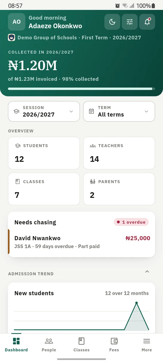
The staff dashboard on the phone. What the school has collected leads, then the counts, then the families to ring first.
Ready to try it with your school?
Three-month Basic trial. No card required to register.